Hand Plot
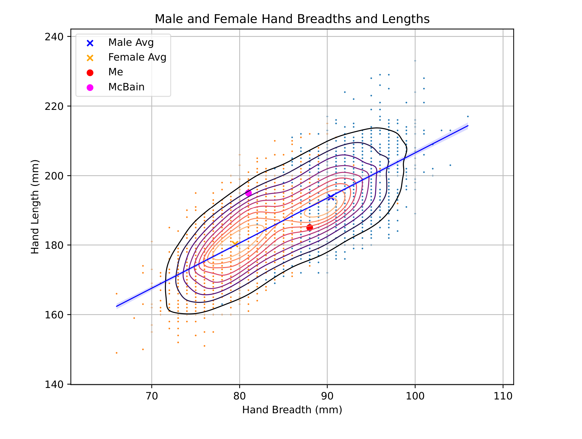
To make sure that I didn’t make a hasty purchase of the ZSA Moonlander, I decided to remake Miles McBain’s plot of ANSUR II hand sizes to assess how “average” my hand proportions were. This resulted in a Python plot that made use of some of its data visualization libraries to create a pretty and informative graphic that somewhat highlights the not-as-bad deviation my hands have from the average of the dataset.
This little project was done by myself over the course of a few days, with most of the work being done on the plane ride to Honolulu in anticipation of the Fall semester starting up.
This project served as a “sequel” to the cal-suite
project I’ve been working on earlier, as I wound up using most of what I had
used then, plus the seaborn library for plots and
pandas for data. Those packages introduced me to a
much more high-level approach to plotting data, which allowed me to work much
faster when my intent was to get something up on the screen, as opposed to a
very specific, detailed graphic which would not at the very least be
inconvenient to do with a high-level interface. That very important
balance/compromise between ease and control is something that I’ve heard often,
but this little endeavor of mine allowed me to experience that difference for
the first time. And of course, it may have saved me from making a hasty purchase
that I may have regretted in the future.
You can find the source code of the project here.